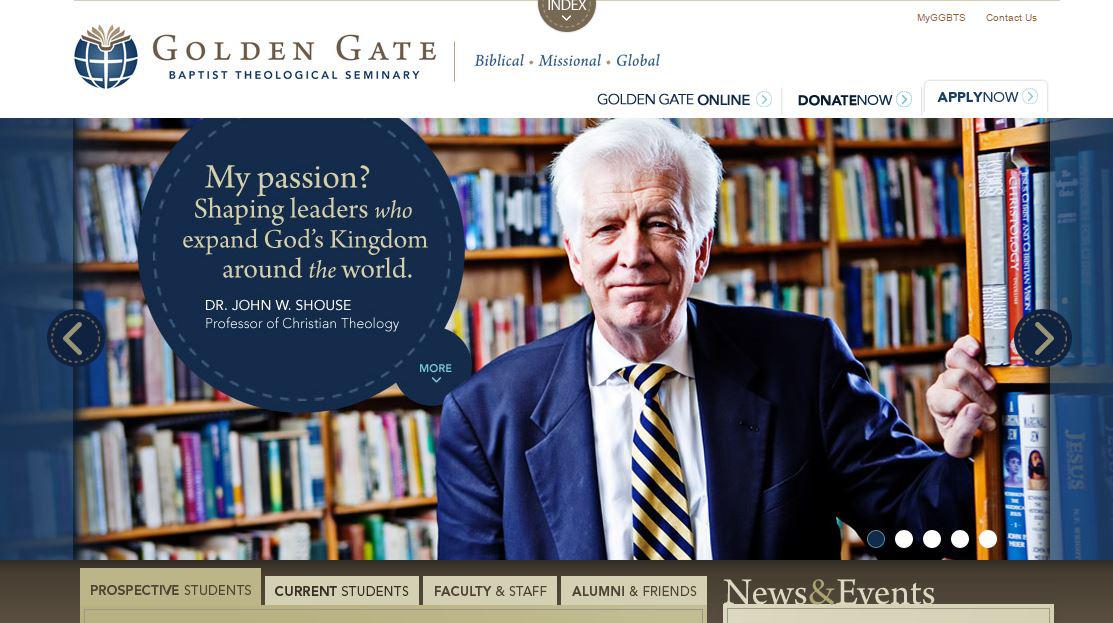
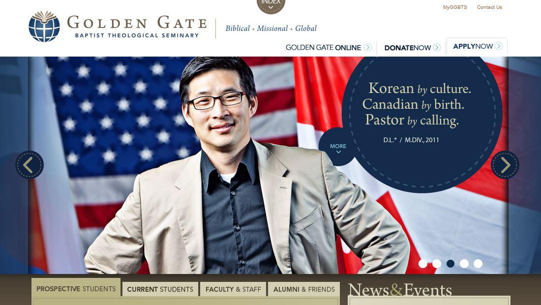
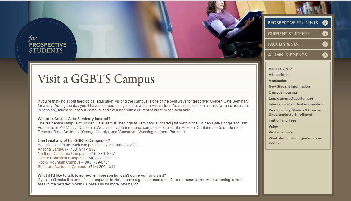
The 67-year-old theological graduate school was ready for a new image and all that it entailed. We engaged Details Communications (DC) for the rebranding of the Seminary’s visual identity and communication tools. A significant component of the campaign was the institution’s web presence.
The goals and objectives with the website redesign were to create a bold, new design interface, develop more interactivity with the Seminary’s global constituents, simplify the site navigation, embrace social media tools, and to bring cohesiveness between the new institutional branding and the website. We sought to quickly engage prospective students and to compellingly tell the stories of generations of students and alumni that have been impacted by the ministry of Golden Gate. There needed to be an easy way for the people to conveniently express interest in the Seminary, learn more about the distinct GGBTS experience, find information about the different campus locations, and hopefully, be compelled to visit one of the campuses.
Phyllis supervised the website development, writing much of the content along with DC. After the site was launched she continued to update the content and graphics.


